Colors of the Year - 2025
Have you seen that meme on social media, with the beige bear stumbling out of its cave looking all disheveled and confused? Although I am still well into my own hibernation era of eating my body weight in carbs and going to bed at 4:00 pm, pulling out of the fog of the holiday season felt a bit like this poor bear’s jaunt. That being said, it is time to pour ourselves into non-pyjama pants, wipe the cookie crumbs off, and get back to work like the heroes we are!
Color is often at the core of good design since it has a powerful effect on many of the other Design Principles such as Texture, Proportion, Scale, and Rhythm. Color also has a tremendous impact on our psychological and physical wellbeing. So let’s toast to our health…with a large glass of hydrating water or nutrient-rich smoothie, of course…and take a look at the industry’s choices for the 2025 Colors of the Year. #COTY2025
The OG in this category is the Pantone Color Institute, which started this annual declaration in 1999 to zhuzh up the conversation on color. After last year’s juicy Peach Fuzz, Pantone’s COTY for 2025 is the dessert-inspired Mocha Mousse. We should’ve seen this coming since all we heard throughout the Fall season was “brown is the new black” and “brown is the color of luxury”. Pantone seems to think that we all need a bit of self-indulgence…don’t mind if I do!!…proclaiming that this color reflects a certain sophistication that is lush yet humble and grounded.
To be frank, I like Pantone’s words more than their color…there, I said it!! I’m all for indulgence, especially the kind that is accessible to all and brings about a sense of comfort and luxe. But this color isn’t it. Mocha Mousse has a peach undertone that somehow makes it more blah than its intended warmth. IMHO what will save this color, should it be used in design, is the use of texture and tone to help it along…think the variegated color gradient of limewash or the depth of a weave or pattern in a fabric.
Moving on to some of the other adopters of the COTY tradition, it seems that most were in agreement that although BROWN may be the new BLACK, it definitely needs some undertones and spice to keep it from being…well…brown!
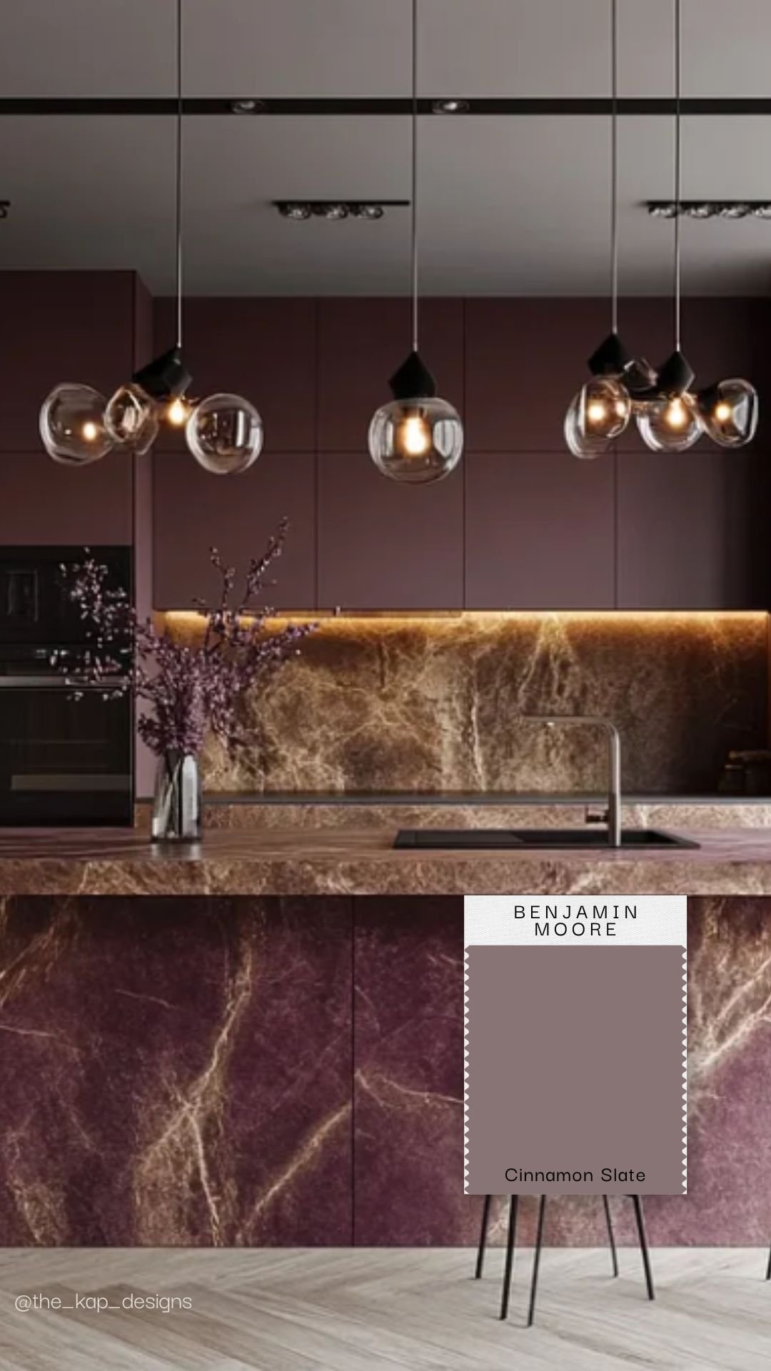
Benjamin Moore is first up with their Cinnamon Slate, where a mellow plum sneaks through the overlay of brown. The beauty of this color is that the plum brings in a cool undertone that creates a rich composition when mixed with other cool colors, whether light or dark. This means that it will play well with light grey oak flooring, as seen in this picture, but can also be BFFs with a dark moody green.
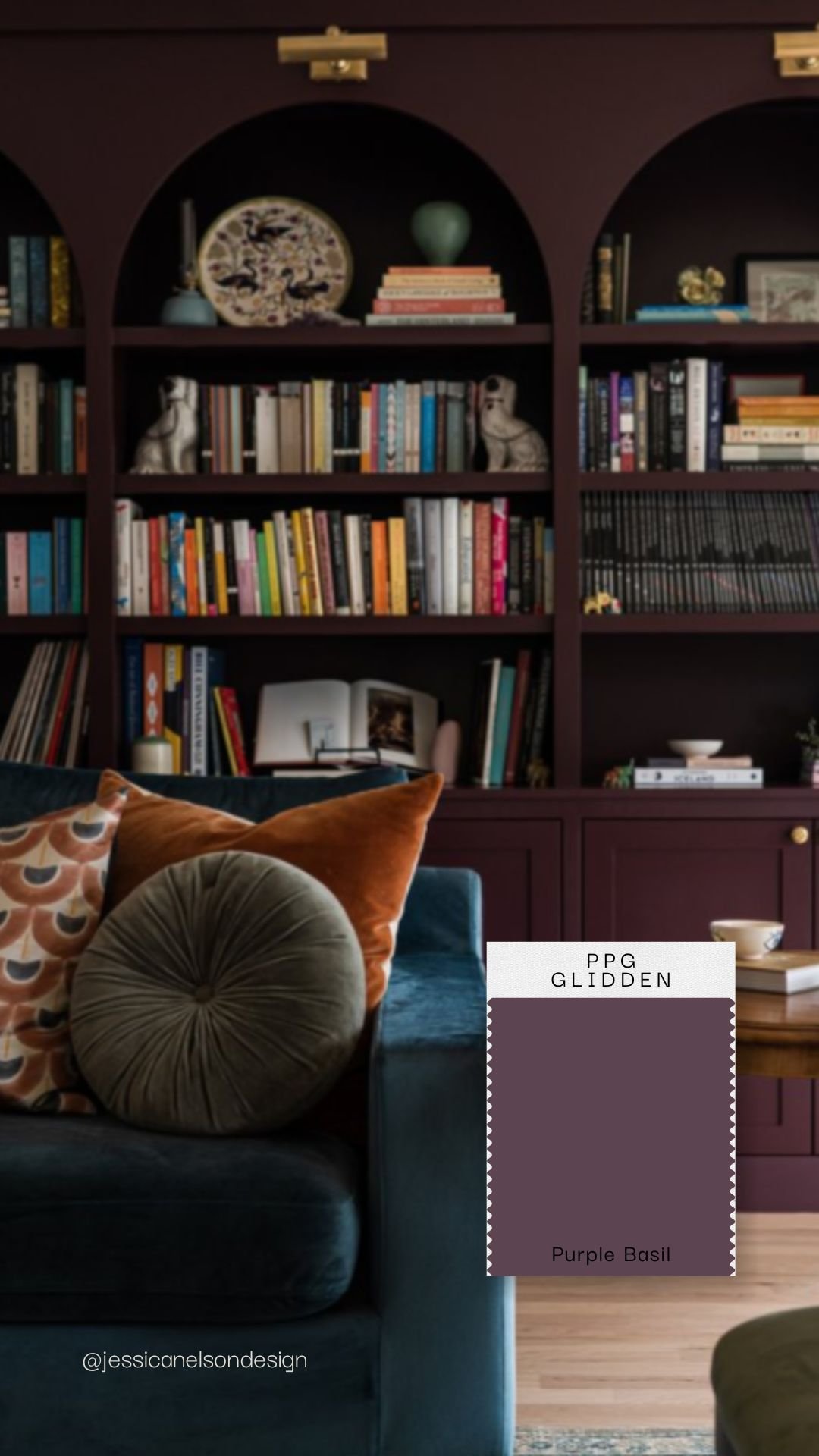
Next up is Glidden’s Purple Basil, which the company touts as a nod towards the recent trend of Maximalism. Much like BM’s Cinnamon Slate, this color has lots of cool red and blue undertones but kicks it up a notch with its much deeper shade. Although I’m not a huge fan of purple, I find this color very interesting in that it can be used across many different design styles. For example, it could be used in a very traditional home with coordinating floral wallpaper or a Mid-Century Modern home with lots of walnut accents. To keep it edgy and prevent it from resurrecting Barney’s Playhouse #IYKYK, use this color in a dark on dark scheme and pair it with blues and greens rather than anything on the reddish spectrum.
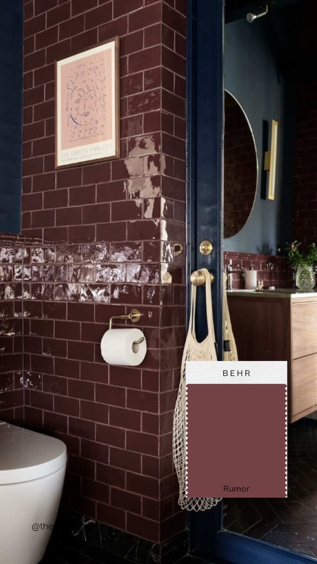
We’ve seen terracotta growing in popularity and Behr seems to have jumped on that wagon with their color choice. Rumor is a deep and rich red and started making an appearance last year in kitchen cabinet trends. This color has lots of blue in its undertones, making it an instant hit with navy and dark greens while letting it hold its own against dusty pinks. Personally, I would love to use this color in a high gloss lacquer on a dining room ceiling, reflecting beautiful golden lighting and balancing crushed velvet walls! I may also recreate this beautiful bathroom below in my own home…just sayin’…
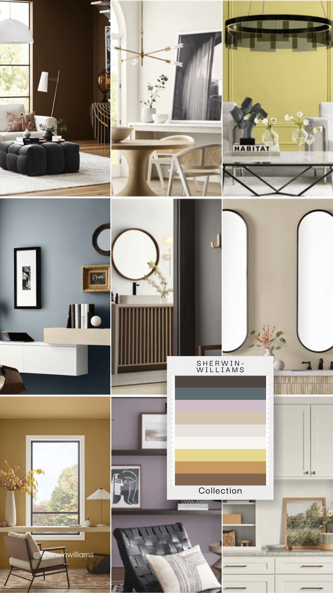
Last but not least, Sherwin-Williams was so excited about color this year that it put a whole collection of hues on the pedestal for 2025! The Capsule offers a lovely rainbow of nine muted colors that play quite well together since they all have cool undertones. Rain Cloud and Clove are by far my favorites amongst this group, with Malabar being a contender - but only if countered with cooler colors or a deep charcoal to balance out its pink undertone.
Color is never just COLOR…Miranda Priestly will tell you that in The Devil Wears Prada! It is intricately intertwined in so many aspects of our human psyche which is why it elicits such strong emotions and reactions in people. The trajectory of the Color of the Year since the early days of the COVID pandemic reads like a sociology textbook, as you can literally see an industry trying to support a society through color.
While a loud and bright Viva Magenta of 2023 was intended to celebrate our achievements against the hardships and loss of the pandemic, it was largely rejected as people weren’t quite ready to forget what they had just experienced. After a course correction towards pseudo-pastels in 2024, perhaps a bit of mature warmth and sensibility will hit the spot.
The Director of Color Marketing at Sherwin-Williams, Sue Wadden, described this year’s color capsule as a “usable assortment of shades”. Indeed, I think this roundup of COTY is usable. Are they thought provoking and inspiring? Do they spark discussion and innovation in design, as was intended by Pantone so many years ago? Not so much. But, being the ultimate seeker of potential optimism, I’m choosing to believe that this iteration of COTY will act like the five minute nap a toddler takes at the back of a car mid-afternoon. It will elicit a complete reboot, propelling our energy and creativity beyond what any of us could have expected. So buckle in, grab a snack, and get ready to get inspired!
About the Author
Founder of TouchStone Interiors
After a successful and rewarding career in military healthcare, Nathalie followed her lifelong passion for design into the next chapter of her life. Beyond her formal education in decor and design, Nathalie continuously seeks out new and exciting materials and finishes to best serve her clients. An active member of the design community, she volunteers with the Decorators and Designers Association of Canada (DDA) and is a member of the National Kitchen & Bath Association (NKBA). Her experience in healthcare and corporate management enables her to simultaneously design a space that caters to her client's physical and mental wellness while delivering a seamless project management solution.


