Book Club
Interiors - The Greatest Rooms of the Century
Phaidon Press
Ok, I’m just going to come out and say it…I judge books by their covers! And from the moment I laid my eyes on this one, I fell in love. The particular one I picked up at my local public library was a bit worse for wear and had that unsightly Dewey Decimal Call number sticker at the bottom of its spine, but I could see past all of that to the splendor of its dark forest green velvet jacket that was so subtly embossed with THREE transitioning patterns - from damask to art deco fans and chevrons. Yes, that is what you get (is it passion…intensity… insanity?) from a book nerd who’s also obsessed with texture and the “hand” of materials.
If that wasn’t enough, the book also comes in multiple cover colors (black, blue, merlot red, pink, orange, saffron yellow, and platinum grey), to suit the aesthetics of your specific space. Now THAT my friends, is a legit coffee table book!
If you’re a professional home stager or photographer or just like pretty things in your home, feel free to stop reading now and just go get your copy. If you’re interested in what’s actually inside this gorgeous package, then read on.
Proving its more than just a pretty face, the book’s Introduction is delivered by William Norwich, former editor of multiple design publications that include Vogue, New York Times, Town & Country, Architectural Digest, and New York Magazine. He eloquently explains his initial concerns with the concept of the book…said bluntly, how could you possibly restrict yourself to a reasonable number of designers from this past century?!! Afterall, this is a coffee table book, not a set of encyclopedias. Not to spoil the plot line but using Elsie de Wolf, the mother of all decorators and designers, as his jumping off point, he indeed manages to run the gamut all the way to more recent designers that have shown the potential to rise to this prodigious level of infamy.
Following the Introduction, we are met with three passages that further delve into the complexities and eccentricities of the evolution and mastery of decor and design. The first by Graeme Brooker, the Head of Interior Design at the Royal College of Art in London, speaks of the earliest concepts of Interiors from burial spaces to the initial concept of decorating. David Netto, designer and contributing editor to many publications listed above, follows with a discourse about more recent evolutions of style reflecting cultural movements. Carolina Irving, textile designer and designer in her own right, rounds out the trio with a discussion on what taste truly is and how this impacts the art of decorating.
Now these aren’t light reading passages, which is a bit of tell-tale sign of the overall mood of this book. There is “intent” behind every single word in this book. The book is laid out alphabetically, according to the designer’s last name, with each page showing ONE picture, a list of credentials such as location and date of project, and a short write-up describing the space and design concept. At first, I was a bit disappointed with the lack of pictures and their compositions. These are not the type of pictures we see in current shelter magazines, rather they serve as benchmarks for the reader to further engage in exploring the design style of the designers. Hence the gravitas I would give this book…this isn’t a book to casually flip through when craving a quick hit of decor dopamine. This is a book you leave on your table and pick up every now and then to study a few pages at a time. Yep, STUDY! This is a book that can truly help refine your design intuition and it deserves your full attention - and definitely a full cup of strong coffee!!
Here are a few of my favorite nerd-worthy discoveries…
My biggest “Ah-Ha” moment was when looking at the dates of the projects. On so many occasions I would stop to look at a space that seemed quite current, only to be surprised that the project had been completed decades ago. This lightbulb moment served as confirmation that great design is truly timeless! Marcel Breuer’s Study from the Koerfer Residence is one of those examples. Completed in 1966, this could easily have been designed last year…or even next year, for that matter!!! There’s a beautiful mix of materials - concrete, black granite, warm woods, buttery leather, and a touch of chrome - so masterfully put together to create a comfortable Brutalist space.
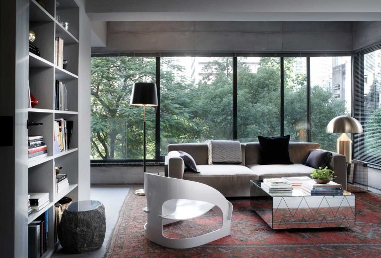
Personal picture from the bookFurther along the alphabet, we see the Living Room of David Kleinberg’s own Manhattan two-bedroom apartment. The building itself is from the 1920’s and David has managed to keep all of that era’s mood cohesively tucked inside the space, without allowing it to feel dated or stale. The grit of the side table and crispness of the artwork firmly entrench the space into the 21st century alongside its Roaring 20’s foundation. Chef’s Kiss…Muah!!
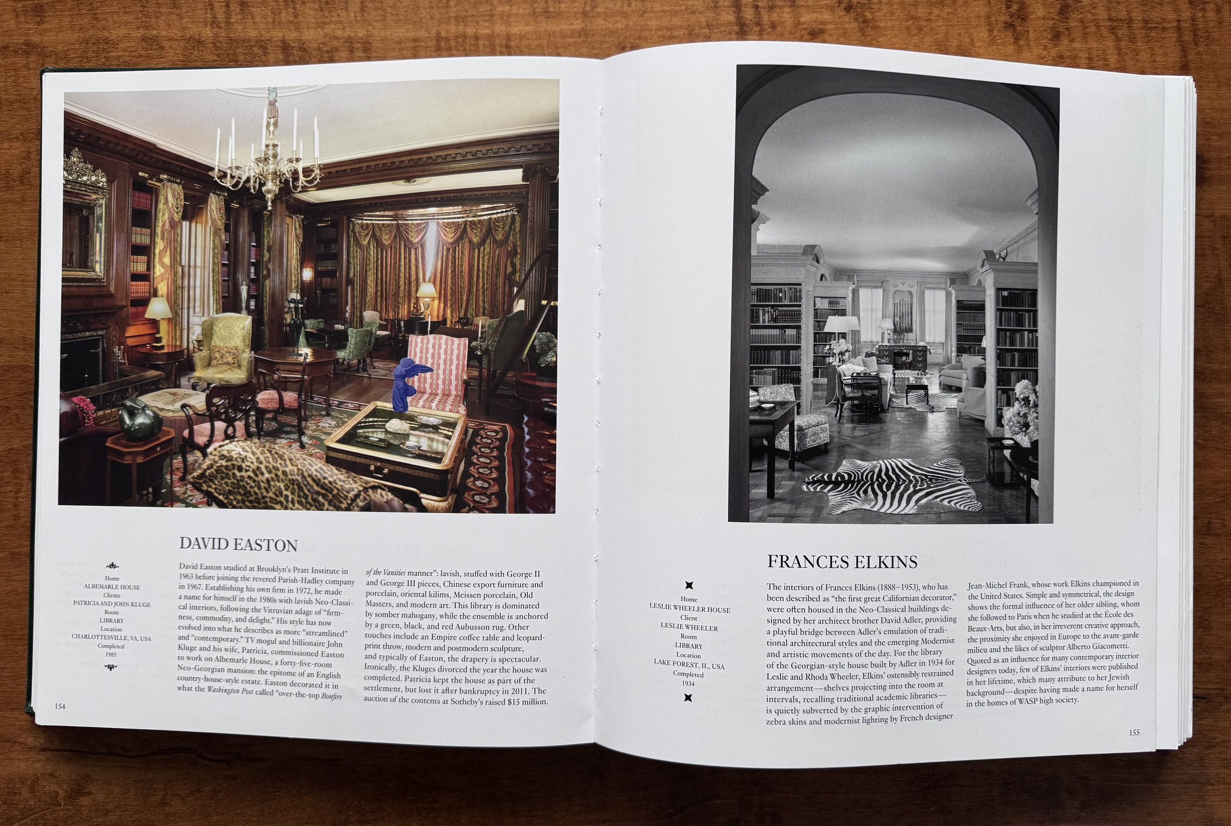
I’m not sure if the publisher meant to do this, but there are two spots in the book where opposing pages offer a fantastic case study in design! The first on page 154 and page 155…when laid open, these pages display two very similar rooms - maximalist libraries full of pattern, wood, and elevated sophistication. Yet 50 years (mike drop!!) separate their project dates…with the earlier design from 1934 looking slightly more current. Shut the front door!!
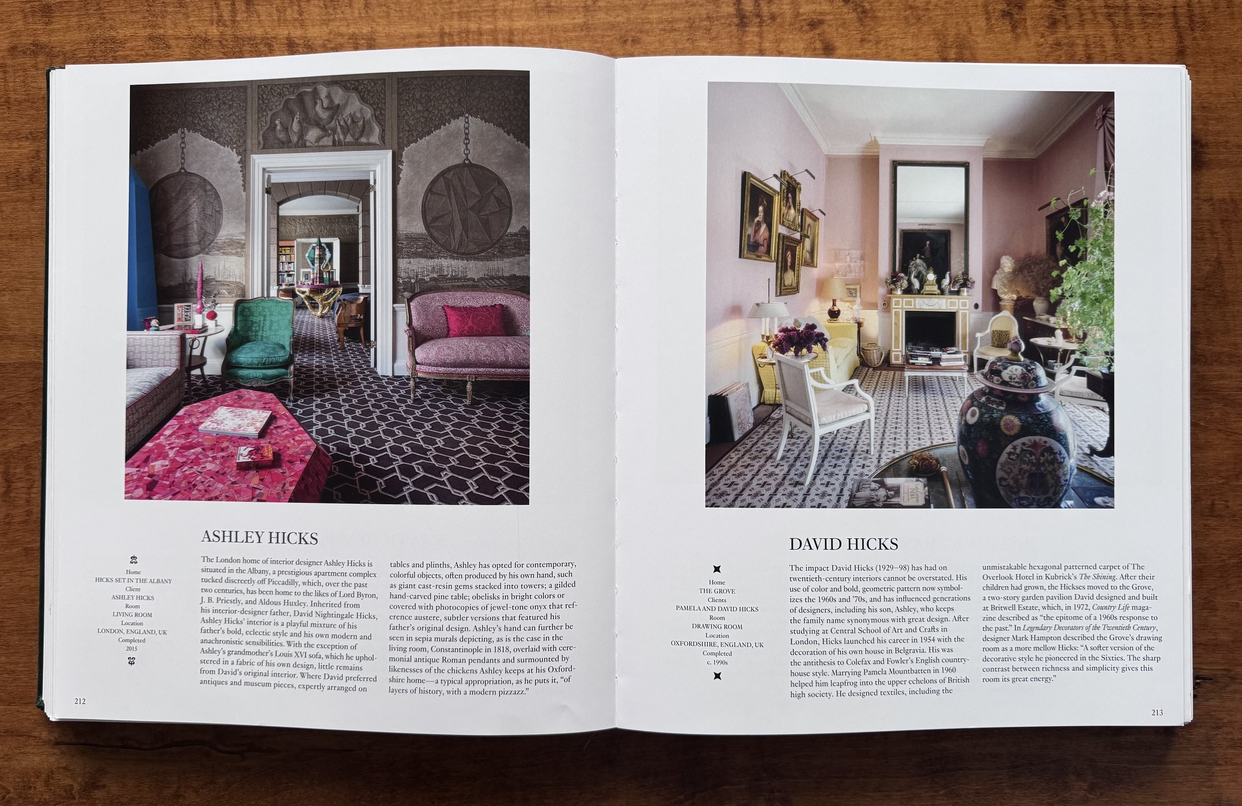
Personal picture from the bookThe second spot creeps up towards the middle of the book…when laid open, the opposing pages display designs by Ashley Hicks (son) and David Hicks (father). There is a 25 year span between the two projects, yet both reflect a common respect for the elements and principles of good design. My tastes bend significantly toward Ashley’s version but I have a definite appreciation for the wisdom that seems to have been passed down through parental guidance. I can only imagine the fabulous conversations had at that dinner table!
Personal picture from the bookThroughout the pages, you’ll find all of the usual suspects among the design crowd - Frank Lloyd Wright, Le Corbusier, the Eames, along with a few fashion superstars that dipped their toes into interiors - Christian Louboutin, Yves Saint Laurent, Karl Lagerfield. There are also those not yet entered into the history books, but nevertheless studied in design schools across the world - Kelly Wearstler, Ken Fulk, Billy Cotton. A few notables from the last two decades on my “to watch” list: Ilse Crawford, Shawn Henderson, Robert Stilin, and Studio Ko.
As mentioned earlier, this is not a book for “zoning out”. It does not provide an easy mood boost from casual flipping through elaborate and shiny pictures of perfectly styled interiors. It is somewhat gritty and exhausting to read through, constantly challenging your mind to figure out what went right and what missed the mark. BUT…I LOVE IT! Beautiful from the outside (bonus!!), it recharged my battery in a completely different way. Like that biology class in high school where you dissect the frog, it was kind of uncomfortable but amazing to see how the “insides” work.
It is an easy decision to add it to my collection…but in which color?!!
Battery Recharge: 90%
About the Author
Founder of TouchStone Interiors
After a successful and rewarding career in military healthcare, Nathalie followed her lifelong passion for design into the next chapter of her life. Beyond her formal education in decor and design, Nathalie continuously seeks out new and exciting materials and finishes to best serve her clients. An active member of the design community, she volunteers with the Decorators and Designers Association of Canada (DDA) and is a member of the National Kitchen & Bath Association (NKBA). Her experience in healthcare and corporate management enables her to simultaneously design a space that caters to her client's physical and mental wellness while delivering a seamless project management solution.


