Pssss…Your Color is Showing!
I love a good adage and “if it ain’t broke, don’t fix it” is one that always rings true with me. This was the case during a recent project where the existing color, On The Rocks by Sherwin-Williams, fit well with the new design concept. Throughout the design phase, I used a large color chip to ensure it aligned with the remainder of design. As the project progressed, I was on-site one day during the painting phase and noticed something odd…
Personal PictureThe new color matched the color chip perfectly - Yay, since I based my other design choices to align with it - but it definitely didn’t match the previous color that had a strong yellow undertone showing through. So what was going on??
After a bit of investigation it turns out that the previous contractor only used Benjamin Moore products, therefore he color-matched the Sherwin-Williams color in Benjamin Moore’s Aura paint. And so evolved this cautionary tale about paint colors and attempts at color-matching.
Now, before we get too far down the proverbial pitchfork-welding-villager road, I want to clearly state that this blog post isn’t about pitting one company against another. In my opinion, both Sherwin-Williams and Benjamin Moore are outstanding companies offering fantastic products. Rather, this post is about explaining the process of color-matching which will help you understand when and how it should be used.
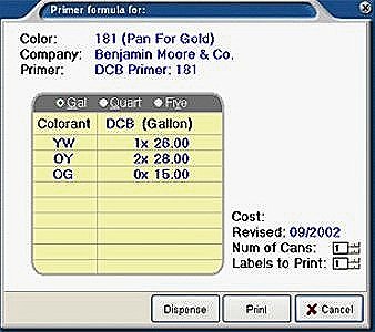
irst we have to look at how paint is mixed and how companies develop their specific colors. If you’re ever able to take a peek at how retail stores mix your paint (Home Depot is a pretty good place to do this), you’ll see that a machine dispenses separate colors into a base paint. What you may not see is that, depending on the company, the inside of those machines contain 9 to 12 cylinders of ultra concentrated pigments - white & black and then an array of yellows, reds, and blues - that, when mixed together using a very specific “recipe”, make up the paint colors you see on the color chips. The other piece of information that isn’t readily available or perhaps obvious is that premium paint companies spend a crazy amount of time, money, and energy developing these pigments with the aim of offering the best product on the market. At the molecular level, these pigments are often quite different from each other even though they look identical to the naked eye.
Now, when you fall in love with a Farrow & Ball color and bring a paint chip to another company to get it color-matched, the staff will likely use a spectrophotometer – AKA a fancy lens that shines a light and views the sample at various angles. The computer linked to the spectrophotometer will then attempt to decipher the color into a “recipe” that it can use with its own company’s pigments to try to recreate that color.
Personal PicturePersonal PictureHere is where the first issue can occur. As I mentioned earlier, different companies have different pigments, which makes it fundamentally impossible to make an exact copy of one company’s color using another company’s pigments. The second place where an issue can occur is with the paint’s base. Premium paint companies spend just as much time, money, and energy on developing what the pigments are going to be mixed into. Over the last few decades we’ve seen huge improvements in the decrease of VOCs (Volatile Organic Compounds) associated with paints but there have also been developments in levels of sheens (Dead Flat to Full Gloss), antibacterial/antimicrobial properties, and even air purifying or neutralizing properties. Therefore, even if we used the exact same pigments, the variants in the base from different company brands might also affect how the color looks once you put it up on your walls.
So what are we to do?!!
There is enough information on which paint to choose for what and when to fill a whole entire other blog (*look for that one coming soon*), therefore I’ll stick to our original purpose here which is color-matching. For me, I’ve always believed that if a paint company spent a bunch of resources and likely years developing colors, who am I to try to imitate that within minutes at a competitor’s store. In the same vein, a perfect replica of an Eames chair is still not an Eames chair…IYKYK. If a client’s budget allows, I’ll let my eyes wander towards the premium luxury brands but if it doesn’t, I’ll stick to the colors found amongst the other quality brands that fit the budget. Finding the right elements to complement the overall design are my expertise - their respective quality and contribution to the design is what is most relevant, not their actual cost. And that is a long-winded way to say that I do not color-match between paint colors. I specify Benjamin Moore paint when I like a Benjamin Moore color, Sherwin-Williams’ paint when I like a Sherwin-Williams’ color, Farrow & Ball paint when I like a Farrow & Ball color…you get the idea…
Where I do use the color-match technology is when I want to match a paint color to something other than paint, like a fabric or other other material. Perhaps there is a pillow sham that I want to match or an evening dress that’s inspired me. In this instance, the spectrophotometer will detect which of the respective company’s existing colors most closely match the material sample I’ve brought in. Most paint companies now will also provide contrasting and complementing colors choices, which won’t do the work for you but can help to get you moving in the right direction. #UseTheRightToolsForTheRightJob
Disclaimer: no paint representatives were harmed in the making of this blog.
About the Author
Founder of TouchStone Interiors
After a successful and rewarding career in military healthcare, Nathalie followed her lifelong passion for design into the next chapter of her life. Beyond her formal education in decor and design, Nathalie continuously seeks out new and exciting materials and finishes to best serve her clients. An active member of the design community, she volunteers with the Decorators and Designers Association of Canada (DDA) and is a member of the National Kitchen & Bath Association (NKBA). Her experience in healthcare and corporate management enables her to simultaneously design a space that caters to her client's physical and mental wellness while delivering a seamless project management solution.


